Friday, November 16, 2007

Close To Home Exhibit

Interlocking Community

In studying the Close to Home exhibit, I developed the concept of creating a community by interlocking spaces, while exposing the structure. I came to this concept after studying materials, light and color in the space. Much of the exhibit is constructed by wood to make spaces. Many of the joints are even made of word. At a small scale this shows the idea of interlocking within the structure itself. Some of the other connections are joined through metal, which locks in with the wood. The wood used to construct the space is much like that of hat Loewenstein would use. Light also plays a role in showing off this exhibit. Much of the light comes from the track lighting on the ceiling that is pointed in specific directions. The lighting is not completely direct. The structure allows for the open awnings that the light beams through, weaving its way onto the graphics. This allows for enough light without being overpowering. The colors used were very natural. The wood remained natural with its blonde and brown shades. This keeps it exposed and true to what it is. The other main color is a teal color that is subdued. This color stays natural as well and helps the wood to pop and be more vibrant, while still bringing attention to the graphics.
The items in the space also support my concept. The images themselves show pictures of Loewenstein’s houses that expose the wood and allow for a taller angled roofline, much like the one shown in the exhibit. The way in which the texts are arranged helps to clarify. The texts are placed on a type of metal wiring, which is bolted onto the wood or the perimeter wall, exposing all connections. All the materials interlock with each other creating a piece of a whole.
Within the exhibit are different forms of media that help to distribute all the information. A projector is used in one of the spaces. It displays a 3-D floor plan that walks the visitor through a specific space where the designed is based of Loewenstein’s ideas. This form of media allows the visitor to gain a better visual of a space designed in such a way, while also giving them the experience of being in such a space. The projector is able to lock the visitor into a space. A computer is placed in two back corners created by the space. This allows for more detailed information. It covers any information that may have been missed while exploring the space. Since the exhibit is not guided, the computer allows for a machine to possibly answer any questions the visitor might have. The main use of distributing information that is the most obvious media is paper with computer-generated texts and images. The paper is placed all around the room almost on every service of the structure. Since this media is everywhere, there is not distinct starting point, which allows the visitor to move further into the space and become lost in the structure. Once starting in one area, the texts move the reader through the space very well. The media surrounding the perimeter of the room keeps the reader locked into the room forgetting they are in a rectangular box.
The components of the exhibit greatly stand out against the space in which it is installed. It is installed in a rectangular room with four walls, one being all glass. The materials of the original space are glass and concrete, which is much different that the wood, metal, and green colors of the exhibit. Because of the size and design of the exhibit, the visitor does not feel as though he/she is in a normal room. When I entered, I felt like I was in several interlocking spaces. The open awnings helped keep the space very open while still closing it in enough to keep in a whole. By placing texts around the perimeter, the normal walls of the space are no longer overpowering and they become part of the structure. The floor is kept the same, but it does not hinder the overall exhibit because the color of the floor is also in the bolts and wiring of the structure. The orange benches also are very different from the exhibit in their design, but the soft orange color closely resembles the color of the wood allowing for them to set in easily.
While this exhibit contains vast amounts of information and is placed in a space much different than the nature of itself, it still remains a whole. It remains interlocked creating a community of exposure.


This view of the structure shows the interlocking beams of the structure and all the other components that lock together to form a whole. The weaving of all the wood also creates several different spaces.


This view of the space shows how the texts lock into the structure, helping to create an easy flow. It shows how the spaces interlock with the information moving the visitor around the structure.


The texts placed on the wall bring the wall into the space joining it to the structure. The line also creates movement through the space keeping an easy flow.

Thursday, November 15, 2007

Detailed Program for Suite in MSH

Bedrooms
-Bed
-Night Stand
-Crib
-Lamp
-Curtains
-Mirror
-Storage
-Picture
-Clock
-Comforter
-Sheets
-Pillows
-Chair
-Curtain Rod
-Shelving
-Television
-Entertainment Stand
-Rug

Lounge Area
-Couch
-2 Chairs
-Table
-Desk
-Storage
-Lamp
-Coffee Table
-Rug
-Desk Chair
-Desk Lamp
-Curtain
-Picture
-Mirror
-Pillows
-Blankets
-Clock
-Radio
-Computer
-Printer

Bathroom
-Toilet
-Bathtub/Shower
-2 Sinks
-Towels
-Towel Rod
-Door Hooks
-Mirrors
-Toilet Paper Holder
-Rugs
-Shower Curtain
-Fixtures
-Cabinets

Individual Intent Narrative MSH

My direction is to build off of what my group has already discovered in the first two stages of this project, while still remembering the ideas of our architect and designers. In designing each of the spaces, I intend to stay with the idea of planar elements that have already been introduced in the building as a whole. I also intend to design so that the spaces flow into one another and create an easy flow of movement that is simple and functionable. While these mothers are growing with their infants and learning, they are creating building blocks to work off of throughout their life. To show this I plan on incorporating many built-ins, which show the parts that make a whole, much like the mothers. This allows for much storage in the space, while keeping it clean and simple.

Thursday, October 25, 2007

Seeing in Color Charrette


Final Tecnocolor Model


Inspiration from Breuer and Bauhaus


Tuesday, October 16, 2007

Self-Reflection

1. This course has opened up my thoughts about design being an important role in the culture and the lives of the people experiencing it. It has taught me what factors to consider when I design. In studying different buildings and styles I have acquired a broader perspective into the design world and what certain "design" elements can offer to an object, structure, or building. This course has provided me with a library of knowledge to use when designing later works.

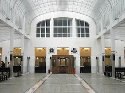
2. One building that we have discussed in class that links forward into today's society is the Post Office Savings Bank by Otto Wagner. This building stood out during its time in the development of modern architecture. This building deals with aspects of design that we are still dealing with during this time period of design. The Savings Bank influenced the idea of incorporating all parts of the design and not just certain parts. It spoke a language simplifying the ornamentation while still keeping it aesthetically pleasing. This building is acting as an example on design today.


3. As designers we cannot forget where we come from. By discovering innovations and ideas from the past we are able to develop the present and future in design. In this way we embrace the past. We have study the cultures and living styles of the past and the architecture and designs that follow it. In doing this we are able to see the patterns and styles that work. This can then be applied to the present design. The knowledge that we have today and the technology we have is added to past designs and ideas to come up with a new innovative design that speaks a language of present day time.

4. For the Icons of Modernism, my group had All In the Family. I learned that the design world had a huge impact on the lives of people in the 50's and 60's. With advancements in technology, the designs also became more advanced with products such as the portable radio, and color TV. Technology allowed the designs to become more innovative throughout the decades. Now, in the 21st century, we are living off the same concept of technology. It is still improving, allowing the design aspects to improve. The products are able to become solely to benefit the consumer and are not having to work around the absence of technology. Also, we are able to have HD tv and ipods, which are a huge advancement from the 50's and 60's, but could not have happened if it wasn't for the designs of that time.

Monday, October 15, 2007

Monday, October 8, 2007

Design Statement

Our direction is to be innovative and to build off of each of our charrettes, as well as keeping in mind the intents of our individual architects and designers. Our intent is to create an innovative design, centralized around an open and simple floor plan, allowing for form to follow the function of the space, and reinterpreting moments with elimination of ornamentation.

Best of intentions just won't cut it/ what have you done for us lately?

We have begun the project, My Sister’s House by doing several charrettes and smaller portions of the project. These “mini” portions include, a light study of the site, a researched book of architects, designers, and artists, a sketchy model of the building, and meaningful moment in the building from our sketchy model, a study of good, bad, and ugly materials, an exterior model of the building, and a refined sketchy model. All of these charrettes have helped our group to develop further into the project and to gain knowledge of what we are trying to convey in our overall design.
In the light study we individually designed a light “machine” to see how the light on the site played on the device we created. This helped us to better understand how we would incorporate light into or design. Our research of different designers, architects, and artists gave us ideas and thoughts about a path to take on our future designs. The sketchy model showed us a general layout and direction for us to go off of in our next designs. We took a closer look at the model in a “moment” in the model. This “moment” we created was an intersection that we found meaningful in the overall design. This helped us to develop details about the space and how different spaces would work together as a cohesive design. In the materials study we learned what materials could be used where. This also allowed us to see what certain materials would be able to do. While developing the exterior we began to tie in all the previous charrettes and studies to decide where the windows should go and how the building would ultimately be designed on the outside. In doing this we looked back to the research on the architect we had studied and the ideas and works of the designers and artists. In our refined sketchy model, we did this same thing, by changing a few things based on our findings.
Overall we started off with small pieces that joined into a whole in the project. The charrettes and studies we did in the beginning are helping to develop our ideas in the larger parts of the project like the exterior and the layout of the interior. We are incorporating our research findings and our study findings into one idea so that are design becomes a cohesive design instead of a plethora of ideas all jumbled into one.

Wednesday, October 3, 2007

seeing a single brick in the wall CHARRETTE

The good, the bad, the ugly

good: recycled steel
bad: fake brick
ugly: chrome

seeing a single brick in the wall CHARRETTE

The good, the bad, the ugly

good: recycled steel
bad: fake brick
ugly: chrome

Thursday, September 20, 2007

Light quality observation later afternoon


In these pictures, I again followed the same procedure as I had been going by. These pictures were taken at mid-afternoon

Light quality observation Afternoon


I attempted to do the same thing in these light studies that I did in the morning pictures. Again, it was still overcast so I was not able to capture much shadow or light.

Light quality observation morning

These pictures were taken in the morning. It was very overcast so there was not much light to play around with. I tried to get close enough though to at least see the shading on the box, and if there was a possible shadow casted.